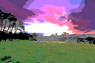
So I've been working hard on this pixelation shader of mine, and the most interesting part for me has been deciding how to clamp the colors from the original image. So far I've tried five different methods, four of which have had some pretty cool results (the other one just looks ugly, to be perfectly honest). Below are the different methods the shader currently supports and an example of how each of them transformed the base image I used.
Original Image
I wanted to make sure the base image I was using had a good representation of varying hues and high contrast. I just found this image on the internet and decided it fit my criteria well enough (it's also a pretty cool landscape shot on its own).
This is the first iteration of the shader I mentioned in my last post. I can reiterate how it works, but all you really need to know is that it creates a palette of 51 colors. Because the colors in the palette are mostly desaturated, this picture is probably the least vibrant of the ones shown here. I want to extend this palette to have a bit more variety of saturation and value, but that'll come later.
The vaporwave palette is honestly a very interesting one. I did a little bit of research on it, and the main thing I noticed is that there's no representation of hues between yellow and green--which you can probably tell by the stark contrast in grass hues here. It's also a bit washed out, which makes for a pretty interesting A E S T H E T I C. I'm really happy with how it came out.
After doing some research on the color palettes used by old gaming consoles, I decided to emulate the old Nintendo Entertainment System palette. This one is very similar to my 51-Color implementation (it actually only has 52 colors), but it has less tolerance for saturation. Colors in the NES palette were apparently either entirely saturated or grayscale, with no in-between. As such, I added a slider to increase the saturation threshhold for this mode (the image was almost entirely grayscale without it).
GBA Grayscale Ramp (Pastel Mix)
I think this one might be my favorite so far. This mode actually just clamps the image to 4 shades of gray (as opposed to 50), and then replaces the grays with a user-defined palette of 4 colors. This palette is the old Game Boy Color "pastel mix", which you could activate by playing an old Game Boy game in a Game Boy Color and then holding down on the D-pad when turning it on. There were apparently 12 different palettes you could activate in similar ways, but this one is my favorite.
And that's it for now. I'll probably be working even more on this shader, but I wanted to post this update showing my progress so far, because I think all of this stuff is super cool.
Thanks again for reading, and I'll see you all soon!
--JBird
--JBird


These look really awesome!
ReplyDeleteThanks! I did a lot of work on these in place of sleeping, so I'm glad it paid off.
Delete